

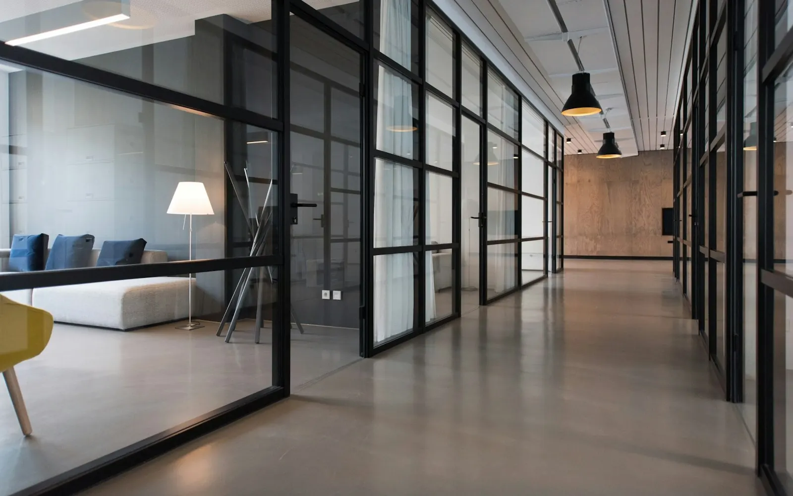
Hero Header overlays a transparent header on a full-bleed hero image. Content begins at the top of the viewport (top: 0) so the first screen is pure brand atmosphere — great for hospitality, travel, photography, luxury brands, and events where one strong visual hooks visitors.
Check scroll behavior in the live demo hub Hero Header preview.
TOC
Best for
- Brands led by a stunning key visual
- Hospitality, travel, restaurants — mood-first industries
- Sites needing LP-like first-screen impact plus deeper sections below
- Visual-first projects using large photos or video heroes
What you can try in the live demo
The Hero Header live demo includes:
- Transparent header over the hero (light nav text/logo)
- Full-viewport hero photography or artwork
- Header background solidifies on scroll for readability
- Headline and CTA inside the hero
- Standard content sections immediately below the hero
- Responsive hero cropping on mobile
Layout features
Header and hero read as one unit. Navigation floats over imagery; after scroll, a solid header background kicks in for long pages. You can still stack Corporate-like sections under the hero — impact up top, information underneath.
How it differs from other types
- Corporate — hero is one section among many; Hero Header owns the full first screen
- Side Header — fixed left nav; Hero Header uses overlay top bar
- LP — single-page conversion; Hero Header allows multi-section sites
Setup tips
- Design Settings → site type Hero Header
- Use high-res hero art with balanced light/dark areas for text contrast
- Prepare a light logo variant for transparent header mode
- Place CTAs in Header Settings where they don’t clash with hero copy
- Avoid plugins that add extra top padding — content should start at zero
Try it now
Lead with visuals? Open the Hero Header demo and compare all nine layouts at the demo hub.
